
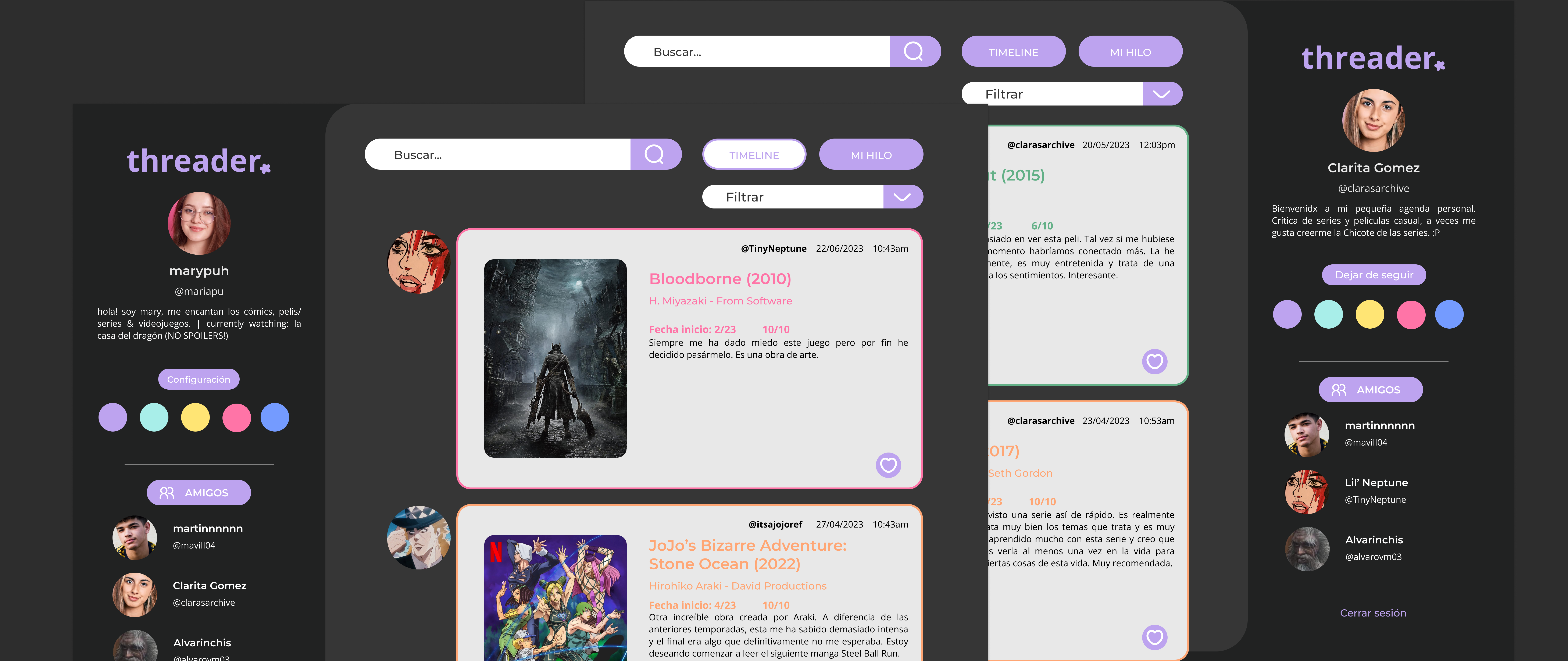

While there are many ways to record what a person consumes throughout their life, existing platforms that offer this functionality often focus on just one type of content or a mix of similar content, such as movies and TV shows or books and comics.
The main goal of this project is to unify these different forms of content tracking. This would result in a platform that serves as a comprehensive portfolio of everything a user consumes. Additionally, the aim is to provide a comfortable, simple, and visually intuitive way for users to organize and track their content according to their preferences.
This platform primarily targets users who already track the content they consume or have an interest in doing so.
When creating user personas, three types of users were considered: those who use tracking websites, those who rely on more analog methods, and those who currently use no system at all. All three types seek simple and clear organization, which is exactly what this platform aims to provide.
My role in this project covered both UX/UI designer and front-end developer, as the back-end portion was handled by another team member.
I conducted extensive user research, including an analysis of similar platforms, the creation and evaluation of forms, and semi-structured interviews. Based on the insights gathered, I developed the navigation architecture, user flows, user personas, and all the necessary elements to move into the design phase and, subsequently, development.
The main challenge of this project is the lack of other projects I can publicly showcase online. Over the past few years, I’ve had the opportunity to work on various projects with different teams and tasks. However, since I was working for an organization, I don’t have explicit permission from clients to freely display my contributions.
On the other hand, I had to learn how to work with the Laravel framework for the first time, which also required an adaptation period.
 Discover
Research phase, in which I identified users’ needs and their potential expectations regarding the final outcome. I explored what is expected from a project of this nature and established clear guidelines to adhere to during the design process.
General survey ⭑
State-of-the-art study ⭑
Benchmarking
 Define
Analysis phase, in which I compiled the collected information in order to study it and define the project’s objectives. I identified problems and opportunities more precisely and established the goals to be achieved, along with potential challenges that might arise and the success criteria.
Affinity map ⭑
Concept map ⭑
Customer Journey Map ⭑
Creation of user personas
DevelopIdeation phase, where I shaped the ideas generated, created prototypes, conducted testing, and iterated on the results.
Brainstorming ⭑
Sketches ⭑
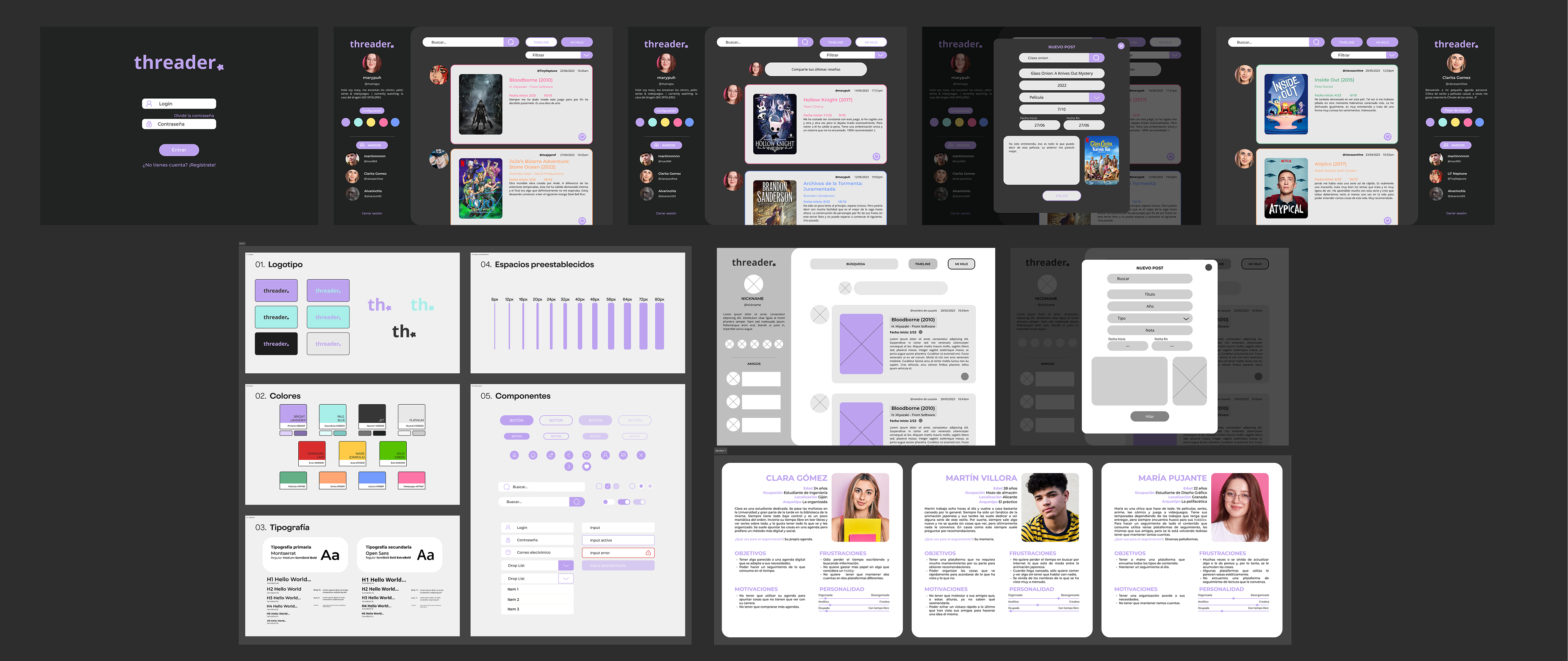
Low-fidelity wireframes ⭑
Design system
DeliverImplementation phase, where the solution is refined and evaluated. At this stage of the project, it must have a defined and functional form and go through various tests to validate it. This process allows for the identification of potential issues in order to address them, as well as functionalities that can be improved or adapted.
High-fidelity wireframes ⭑
High-fidelity prototypes ⭑
Usability testing
After the usability tests, we did not identify any issues that required fixing. Users followed their tasks and completed them successfully, navigating the website in a smooth and intuitive manner. This, along with a final project grade of 8.8/10, results in a successful case.
However, looking back with more perspective and reviewing especially the design and development aspects, I can see things that I would now approach with greater attention to detail and better organization. I don’t rule out revisiting and refining the project in my spare time :).
One thing I took into account after finishing the project was that it was neither responsive nor accessible, something I included as future work in my final presentation.
It’s a reasonable excuse for a student, but with my current experience I know that accessibility is not something to be implemented at the end, but rather something to be considered from the very beginning of a project. If I were to revisit this project, I would start by adapting the color palette, typography, and many components whose design now feel insufficiently refined.
Another aspect that stands out to me is how I used Figma at the time... I didn’t get along well with auto-layout back then, and now I can’t live without it.
In any case, everyone has to start somewhere, and my student self was very proud of the outcome of this project, despite the many shortcomings I can now identify.


